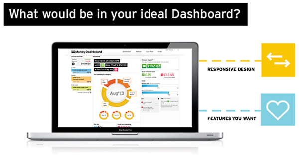
Money Dashboard want to know what would make your ideal dashboard, as they look to improve their account aggregator tool.

They’re already working on a “responsive design” for the site, which means that the layout will adapt to whatever device you’re using, and probably explains their lack of dedicated mobile apps up to this point. A good responsive design might make apps unnecessary. They’re also trying to improve loading speeds, and hopefully account refresh speeds.
If you have any ideas of your own, you can let them know on their Facebook page.
Weekly Emails
Money Dashboard have also recently introduced a weekly “Financial Summary Email”. It provides users with a snapshot of their finances over the previous 7 days, including where they’ve spent their money, their balance changes and any untagged transactions. Existing users will need to opt in to these emails to start receiving them.
These changes are probably the biggest developments to happen to Money Dashboard since they switched from using the Silverlight plugin a while ago, which itself was a wise move.
The single most important thing for a account aggregation site is for them to support as many providers as possible!! There’s little benefit to using a site like this unless all your financial institutions and account types (current, savings, investment, ISA, etc) are supported.
I recall signing up for a site that supported my bank’s current/savings accounts but not investment account. I didn’t use it for very long!