Halifax have announced that they’ll shortly be launching a redesign of their online banking website.
The redesign of Halifax online banking is intended to make using it simpler and quicker, giving you easier access to the features you use regularly.
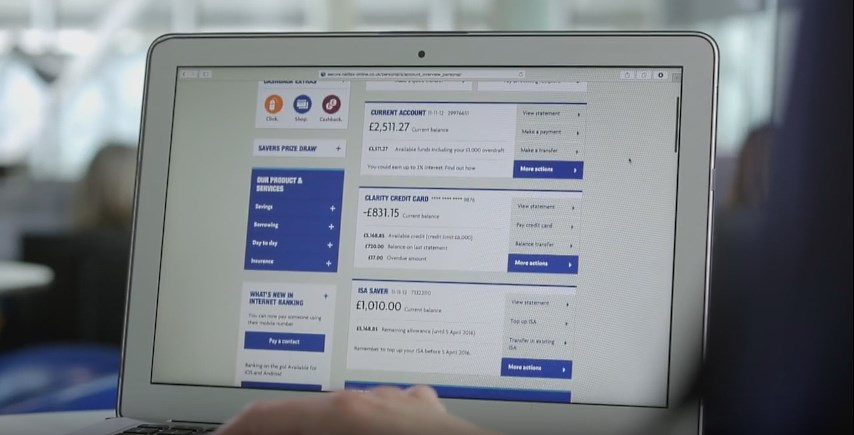
The changes at a glance
- A fresh new design makes it easier to discover new features and helps you find the things you do most often.
- The new ‘More actions’ button gives you quick access to tasks like managing Direct Debits and setting up standing orders.
- View your full available balance and make payments and transfers directly from your Online Banking homepage.
- Designed to be easier to use on touch screen devices.
You can view more detail about the changes on the Halifax website. Here’s a video explaining some of the changes and giving an idea of what you can expect from the redesign:
It’s worth mentioning that usernames, passwords and memorable data will not change; you’ll continue to use your existing login credentials. There are also not going to be any changes to the mobile app.
The new look isn’t currently available, but Halifax clients will be notified when the changes are live.
From the limited views I’ve had of the redesign, it does look as if Halifax have made their online banking site cleaner, but once it’s launched, we’d love to hear your thoughts. Let us know what you think of the redesign in the comments below.
Halifax needs to undertake a major overhaul of its online banking service instead of tinkering at the edges with revamps of limited features. It’s shocking that Halifax still does not give customers the option to enable 2-factor authentication for the ‘front end’ login. The website has no secure messaging – all queries have to be made by telephone, branch or old-fashioned post. For many customers, maybe worst of all is the total absence of any money management tools.
The design seems quite handy as compared to the previous one. But I think Halifax needs to give emphasis on the Front end login issue apart from some of the other minor setbacks. The online system also needs some update considering the fact that banking sites nowadays are more user friendly.
The new design is ghastly. Space-wasting, ugly and awkward to read font, difficult to navigate easily and has made my attempt to gather information for my tax-return a chore.
There are fewer statement lines visible than before and it spans two lines, making it difficult to read and reconcile.
All in all. A nasty piece of work.
I totally echo Stu Neville’s accurate comments – I absolutely hate the new Halifax Online web design, it’s horrendous!
The tiny writing is hard to read, it’s a nightmare to navigate and see my account balances or make transfers and it’s hideous.
To add insult to injury I had absolutely no warning – overnight it changed and I was never even asked to trial it or given the option to use the old site.
Sadly, web designers keep pushing “clean and simple”….
…which means we end up with acres of empty space – and more work (i.e. scrolling)…..
…and guesswork navigation.
HUGE photos and panels reduce visible content.
Lines are made higher, meaning less content in view.
Navigation that is indistinct from passive content – worse when text in a panel turns out to be a label not a button.
Often fewer Menu items.
Statements are harder to read due to lack of lines.
Transactions are in reverse order – most recent at the top. How are we exopected to cross-reference to the printed statement, written notes or a spreadsheet ???
Worse, the toggle to invert dates to normal has been removed … replaced by a column of obscure logos ….that seem to replicate another column.
“Load more” transactions is not helpful.
Have options for: the last 30 days, the last 20 transactions; – i.e something more quantified than “more”.
Lastly – GREY TEXT.
Halifax’s text may be a tad darker than this Blog…..
But WHY do Designers force Visitors to squint to focus on pale grey text on white backgrounds ?
So far, Designers have not produced a site with text that is “too black”