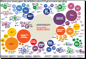
Just before tomorrow’s pre-Budget report, I thought I’d point out this PDF chart (200K PDF) from the Guardian, which shows where all the money collected from taxes actually gets spent.
I haven’t yet had chance to fully digest all the information shown, but I’m hoping to point out all of the most interesting points in a future post.
Thanks to Where Does It Go? and Burning Our Money for pointing this chart out.

How did I miss this? Great spot.
On the ‘were the money goes PDF chart.
The totals for defence don’t add up! look at the defense portion of the chart at ‘Defence budjet total states £32.6bn. if you add up :-
Operating costs 28.3bn
Saleries 11.5bn
New equipment 6.0bn
war pensions 1.0bn
total should read 46.8bn then the total for the MOD should read £49.8 a £50bn on defense ties up nearer with other sites on the web.!
The Chart is good but is there one for 2009 – 2010, where is the money spent on the European Government.