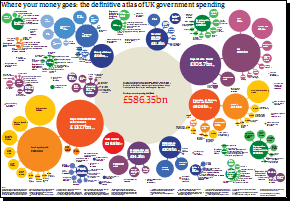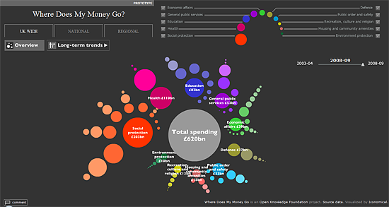
We’ve previously featured a chart showing where all of our taxes get spent, and now thanks to the not-for-profit organisatoin Open Knowledge Foundation (OKF), there’s a website that will show you in even more detail.
Where Does My Money Go sources most of their data from the Public Expenditure Statistical Analysis (PESA), which is the highest level breakdown of Government spending.
The data is cleaned and then fed into their website, which allows you to visualise the data in some pretty neat ways:
But of course, it doesn’t end there. Should you be so inclined you can get your hands on the data yourself from a set of Google Docs the OKF have put together, and then you are free to do what you want with it.
The OKF is now exploring ways of getting a greater level of detail out of the UK Treasury, using their Combined Online Information System (COINS). If you’re interested reading more about this, there’s a recent article on the Guardian which explains the difficulties in working with such a large, sensitive dataset.
What do you think about the openness of this type of data? Personally, I think it’s great that the public has access to this level of information, and the transparency it should bring to Government. Let us know your thoughts in the comments below.

I object to what I see as huge amounts of waste with my tax money supporting civil servants who work relativly few hours each week and are not controlled in the same way as private sector workers with regard to performance
well said. also we are taxed far more than the figures show are being spent, its simple maths- so where does the rest go?