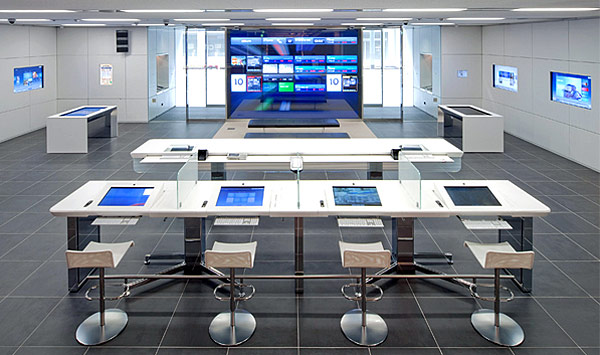
When we think about innovation in financial services, we’ll often ask ourselves questions such as “if Google was a bank, what would it do?” or “If Apple designed bank branches, what would they look like?”.
Well, we could already have the answer to that second question, thanks to Citibank’s prototype branches.
We reported back in December on the opening of Citibank’s “branch of the future” in New York, and the company behind the redesigns of this and several other flagship branches, Eight Inc, was also behind the Apple Store design.
Eight Inc have shared some of their thoughts on the process on their website:
With Citibank we focused on the customer needs. How they live. What makes them successful. Placing the customer at the center. The result is a completely new retail strategy, new banking experience and simple new tool sets. Making the complex simple is the foundation for the new Citibank manifesto.
The Financial Brand has a more detailed look at Citibank’s Apple-esque prototype branches in New York, Hong Kong and Japan, with photos and video walk-throughs.