Nationwide has announced that it is to begin rolling out a new design and new functionality to its internet banking website.
Nationwide claims it was the first financial institution to introduce an internet banking service in the UK back in 1997, and although their current online banking site has been successful, it is in need of an update.
So what is changing?
Nationwide lists the following key changes:
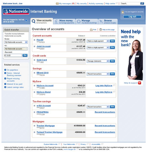
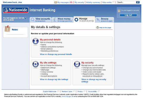
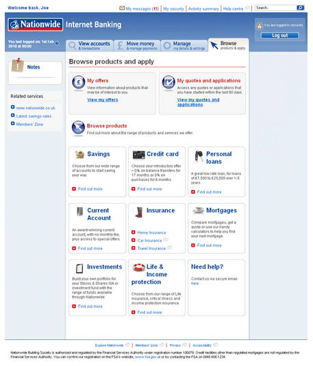
- A new modern user-friendly design with more interactive and intuitive navigation (see screenshots below)
- A redesigned, quicker registration process
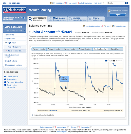
- New ways to manage your money – you can view your statements in graph or calendar formats to help you track your spending
- Simplified payments and transfers process, making it easier to manage your online payments
- More help and support – guided walkthroughs of common processes, improved help text and demos.
The graphs and calendar formats sound probably the most interesting of the changes, giving Nationwide customers some simple PFM tools in their online banking.
Screenshots
View your Nationwide accounts:
Access and edit your internet banking settings:
View and apply for new Nationwide products:
View any quotes and applications you’ve made:

Calendar view of your transactions:

Graph your cashflow:
A breakdown of the money paid into your account:
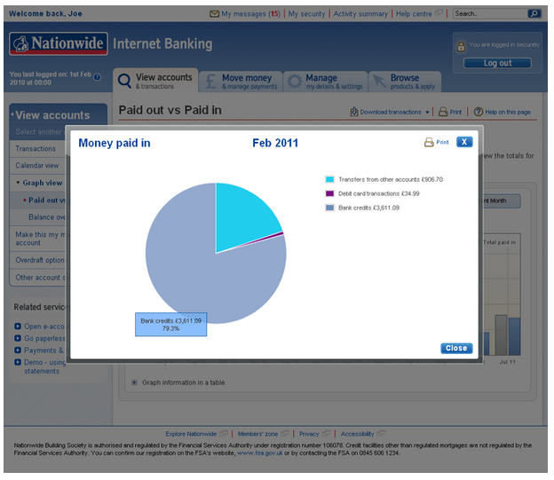
They’re aiming to roll out the new design to all users before the end of 2011. Nationwide say that there are no current plans to develop dedicated mobile apps for internet banking with them, but the new site will be designed to be compatible with both smartphone and tablet web browsers, so it should still be accessible on iPhones and iPad as well as other devices.
If you’re a Nationwide customer, let us know your thoughts on the new designs in the comments below.
I am so disppointed with Nationwides new website. A lot of the fonts are barely readable as they break up & are not solid. The site is dreadful to use. Bring back the old site, please?
I am unable to use it quickly & it is impossible to look at an account with direct debite over a period of time that have gone out.
In fact, it has taken me a lot of valuable time trying to look at my accounts, etc., Would love to hear others comments.
I wouldn’t mind the re-design if I could login!!
Been trying for two days now, shocking…
I wouldn’t mind the new design if I could log out!
Been advised to close the window and let the system log me out.
Good – NOT!
I have now been trying for the last hour to log-in with no success, so now I am going to have to give up my time tomorrow to go into the branch to find out how to do this. Might give up on my online account if it is this difficult to access.
A warning to users of the new site to check their personnel details. By sheer luck I found that they had me registered at an address that I had never lived at and sent my savings statement there. Where they got it from I have no idea.
Well done, you’ve made a terrible interface worse. It might work (I’ve struggled to get that far), but everything is fighting for attention, you don’t know where to look. It’s ugly and unintuitive. You need to commission an agency that understands interface design. A fantastic opportunity missed. Shame I had high hopes and I like the bank, but my online Barclays account is soooo much easier.
The new site is not easy to use. The old one is much quicker and busy people do not appreciate unecessary changes. In the payments section the use of drop down menus to gain extra info. is unecessary and adds time to the process of differentiating between payees – please bring back the old site.